How to Read a Stock Chart: A Beginner’s Guide

How to read a stock chart involves understanding key components like price history, volume, and technical indicators, which, when analyzed together, can provide insights into potential future price movements for informed investment decisions.
Embarking on the world of investing can be daunting, especially when faced with cryptic stock charts. **How to read a stock chart: a beginner’s guide to technical analysis** is designed to demystify this essential skill, providing you with the knowledge to interpret market trends and make informed investment choices.
Understanding the Basics of Stock Charts
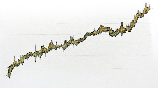
Stock charts are visual representations of a stock’s price movement over a specific period. They provide valuable information about the stock’s historical performance and can help investors identify potential patterns and trends.
What is Technical Analysis?
Technical analysis is a method of evaluating investments by analyzing statistics generated by market activity, such as past prices and volume. Unlike fundamental analysis, which focuses on a company’s intrinsic value, technical analysis concentrates on identifying patterns in price and volume data to predict future price movements. This approach is based on the idea that the market discounts everything, meaning that all known information is already reflected in the price.
Key Components of a Stock Chart
A typical stock chart includes several key elements that provide insights into the stock’s performance. These elements include:
- Price History: The historical prices of the stock, usually displayed as a line or candlesticks.
- Volume: The number of shares traded during a specific period, indicating the level of interest in the stock.
- Timeframe: The period over which the data is displayed, such as daily, weekly, or monthly.
- Technical Indicators: Mathematical calculations based on price and volume data, used to generate trading signals.
These components work together to give you a comprehensive view of a stock’s behavior, allowing you to make more informed trading decisions.
In summary, understanding the basics of stock charts and technical analysis is the first step towards becoming a successful trader or investor. By familiarizing yourself with the key components and principles, you can unlock valuable insights into market trends and make more informed decisions.
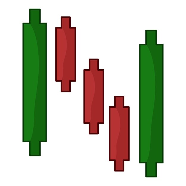
Candlestick Charts: A Detailed Look
Candlestick charts are a popular way to visualize price movements in the stock market. They provide more detailed information than simple line charts, making it easier to identify patterns and trends.
Anatomy of a Candlestick
Each candlestick represents the price movement of a stock over a specific period, such as a day or a week. A candlestick consists of the following parts:
- Body: The colored part of the candlestick, representing the range between the opening and closing prices. A green or white body indicates that the closing price was higher than the opening price (bullish), while a red or black body indicates that the closing price was lower than the opening price (bearish).
- Wicks (Shadows): The thin lines extending above and below the body, representing the highest and lowest prices traded during the period. The upper wick shows the highest price, while the lower wick shows the lowest price.
Understanding the anatomy of a candlestick is crucial for interpreting the information it provides about price movements.
Common Candlestick Patterns
Candlestick patterns are specific formations that can indicate potential future price movements. Some common patterns include:
- Doji: A candlestick with a very small or nonexistent body, indicating indecision in the market.
- Hammer: A bullish reversal pattern characterized by a small body and a long lower wick, indicating that the price may be about to rise.
- Shooting Star: A bearish reversal pattern with a small body and a long upper wick, suggesting that the price may be about to fall.
Recognizing these patterns can give you an edge in predicting market trends and making informed trading decisions.
In conclusion, candlestick charts are a powerful tool for understanding stock price movements. By learning to interpret the different parts of a candlestick and recognizing common patterns, you can gain valuable insights into market trends and make more informed trading decisions.
Volume Analysis: Confirming Price Trends
Volume analysis is the process of analyzing the volume of shares traded to confirm the strength of price trends. Volume provides valuable information about the level of interest in a stock and can help you determine whether a price movement is likely to continue or reverse.
The Relationship Between Price and Volume
In general, a rising price accompanied by increasing volume suggests that the trend is strong and likely to continue. Conversely, a rising price with decreasing volume may indicate that the trend is weakening and could soon reverse.
Volume Indicators
Several volume indicators can help you analyze the relationship between price and volume. These indicators include:
- On Balance Volume (OBV): A cumulative indicator that adds volume on up days and subtracts volume on down days.
- Accumulation/Distribution Line (A/D): A similar indicator that considers the location of the closing price within the day’s range.
These indicators can provide valuable insights into the strength and direction of price trends.
To summarize, volume analysis is an essential part of technical analysis. By understanding the relationship between price and volume and using volume indicators, you can confirm the strength of price trends and make more informed trading decisions.
Moving Averages: Smoothing Out Price Data
Moving averages are widely used technical indicators that smooth out price data over a specific period. They help to identify the direction of the trend and potential support and resistance levels.
Types of Moving Averages
There are several types of moving averages, including:
- Simple Moving Average (SMA): Calculated by taking the average price over a specific number of periods.
- Exponential Moving Average (EMA): Gives more weight to recent prices, making it more responsive to new information.
The choice of moving average depends on your trading style and the specific characteristics of the stock you are analyzing.
Using Moving Averages in Trading
Moving averages can be used in several ways, including:
- Identifying Trends: A rising moving average indicates an uptrend, while a falling moving average indicates a downtrend.
- Generating Trading Signals: Crossovers between two moving averages can generate buy or sell signals.
- Identifying Support and Resistance: Moving averages can act as dynamic support and resistance levels.
In conclusion, moving averages are a valuable tool for smoothing out price data and identifying trends. By understanding the different types of moving averages and how to use them in trading, you can improve your ability to make informed investment decisions.
Support and Resistance Levels: Identifying Key Price Points
Support and resistance levels are key price points where the price tends to find support or resistance. These levels represent areas of buying or selling pressure and can be used to identify potential entry and exit points.
Identifying Support and Resistance
Support levels are price levels where the price tends to stop falling and potentially reverse upward. Resistance levels are price levels where the price tends to stop rising and potentially reverse downward.
Using Support and Resistance in Trading
Support and resistance levels can be used in several ways, including:
- Setting Stop-Loss Orders: Placing stop-loss orders just below support levels or just above resistance levels can help you limit your losses.
- Setting Profit Targets: Setting profit targets near resistance levels in an uptrend or near support levels in a downtrend can help you lock in your gains.
Understanding and utilizing support and resistance levels helps to optimize trading strategies and manage risk effectively.
In summary, support and resistance levels are essential concepts in technical analysis. By identifying these key price points and using them in your trading strategy, you can improve your chances of success in the stock market.
Putting It All Together: A Step-by-Step Guide
Now that you have a basic understanding of stock charts and technical analysis, let’s put it all together with a step-by-step guide to reading a stock chart.
Step 1: Choose a Stock Charting Platform
There are many stock charting platforms available, both free and paid. Some popular options include TradingView, StockCharts.com, and Yahoo Finance.
Step 2: Select a Stock and Timeframe
Choose the stock you want to analyze and select an appropriate timeframe. For short-term trading, a daily or hourly chart may be suitable, while for long-term investing, a weekly or monthly chart may be more appropriate.
Step 3: Analyze the Price Action
Look at the price history and identify any patterns or trends. Are the prices generally rising or falling? Are there any recognizable candlestick patterns? Use the knowledge acquired to find trends in the chart.
Step 4: Use Technical Indicators
Add some technical indicators to the chart, such as moving averages, RSI, or MACD. Use these indicators to confirm the trends you identified in step 3 and generate potential trading signals.
Step 5: Confirm with Volume Analysis
Check the volume to confirm the strength of the price trends. Is the volume increasing during uptrends and decreasing during downtrends? The overall understanding will give you valuable insights.
Step 6: Identify Support and Resistance Levels
Look for potential support and resistance levels. These levels can help you identify potential entry and exit points, as well as set stop-loss orders and profit targets.
In conclusion, reading a stock chart requires a combination of knowledge, practice, and patience. By following these steps and continuously honing your skills, you can become a proficient technical analyst and make more informed trading decisions.
| Key Concept | Brief Description |
|---|---|
| 📈 Candlestick Charts | Visualize price movements with detailed open, close, high, and low prices. |
| 📊 Volume Analysis | Confirm price trends by analyzing trading volume; rising price with high volume suggests a strong trend. |
| 📉 Moving Averages | Smooth out price data to identify trends and potential support/resistance levels. |
| 💰 Support/Resistance | Identify key price levels where the price tends to find buying or selling pressure. |
Frequently Asked Questions (FAQ)
▼
Stock charts visually represent price movements, aiding in identifying patterns and trends for informed investment decisions. They offer a historical perspective that helps in predicting future movements.
▼
Candlestick charts provide more detailed information by showing the open, close, high, and low prices for a specific period, whereas line charts only display the closing prices connected by a line.
▼
Volume indicates the level of interest in a stock. High volume during a price movement can confirm the strength of the trend, while low volume may suggest a weaker, less reliable trend.
▼
A moving average smooths out price data over a specified period to identify the direction of the trend and potential support and resistance levels, making it easier to spot long-term trends.
▼
Support and resistance levels help identify key price points for potential entry and exit, setting stop-loss orders, and defining profit targets, thereby enhancing risk management and profitability.
Conclusion
Understanding **how to read a stock chart: a beginner’s guide to technical analysis** is an invaluable skill for anyone venturing into the stock market. By grasping the basics of chart patterns, volume analysis, and key indicators, you can make more informed decisions, manage risk effectively, and improve your chances of investment success. Continue practicing and refining your skills to unlock the full potential of technical analysis.


